Listen and fix!
—Nov 29th, 2024

Yes, I had to update our company logo within the first month of its existence! Here’s a quick story about why.
The Initial Idea
When designing the original logo, I wanted it to achieve three key things:
- Convey a strong, industrial feel—something that screams straight-to-the-point work and productivity.
- Give a subtle nod to where the company is located on the world map.
- Send a clear message that we’re open for business in global markets.
What did I do?
Let’s start with the name: Studio Prodwerk.
- Prod comes from product.
- Werk is the German word for work.
Together, it stands for Product Work—with a little inspiration from the legendary band Kraftwerk.
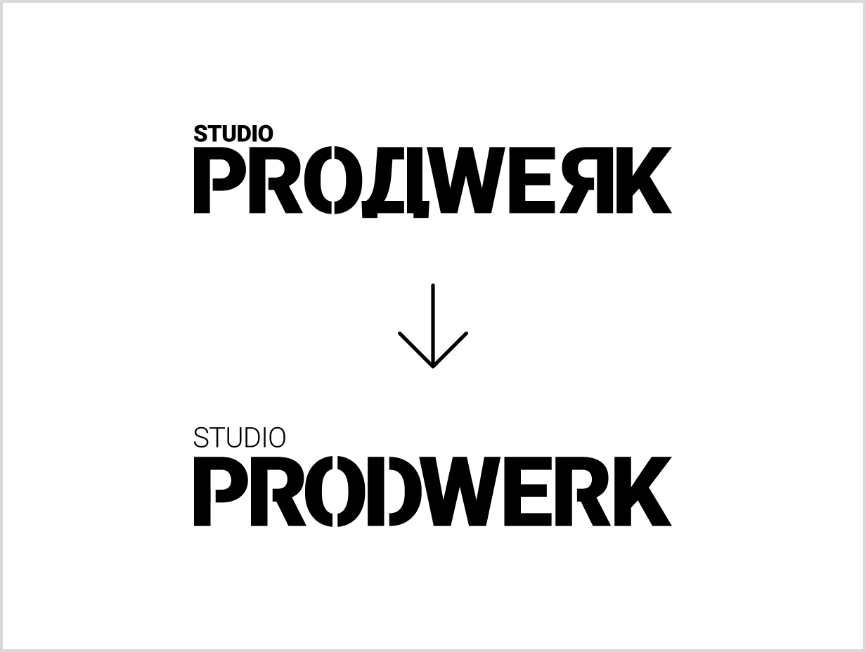
For the design, I opted for a stencil-style aesthetic, the kind you’d associate with street art. To reinforce the industrial vibe, I cut the letters with vertical lines, mimicking the appearance of a real-life stencil.
Next, I addressed the global aspect by incorporating a Cyrillic letter “D.” Fun fact: Serbia, where I’m from, is one of the few countries with two alphabets. Using the Cyrillic “D” not only grounded the logo geographically but also amplified its industrial feel, which I loved.
Finally, I flipped the second “R” in “Prodwerk” to reflect a touch of Slavic culture.
And there it was—a bold, distinctive logo ready to represent the brand. I proudly posted it everywhere.
The feedback
The initial response was positive—most people liked it, and I felt I’d nailed the brief. But then came the voices of reason, which I couldn’t ignore:
- People who liked it were primarily from my country, where the Cyrillic “D” is familiar. Potential partners and clients abroad wouldn’t recognize it.
- That flipped “R”? In Cyrillic, it’s actually pronounced “ya,” not “r.” So, even folks from Eastern Slavic countries wouldn’t read it as “Prodwerk.” Instead, they’d pronounce it Prodwyak at best, which… wasn’t ideal.
The cold, hard truth? Outside a small group of people, no one could actually understand the logo. I had two choices:
1. Stick with it and hope that my love for the design would somehow outweigh practical concerns. 2. Adapt and change the logo.
Again, what did I do?
I changed it, of course! The company is still young enough to bounce back from this adjustment. Now, the logo represents the company name clearly and accurately, which benefits everyone.
This experience is a textbook example of Lean principles. I had a hypothesis, and the MVP of the logo was quickly pushed to production. The real-life user feedback was clear, honest, and constructive—pointing out exactly why the logo didn’t work.
What struck me most was how passionate people were about their feedback. It wasn’t just criticism; it came from a place of genuine care, and I truly appreciated that.
So, I listened. And I’m so glad I did. You can see the new logo on our website, LinkedIn, and X. I’m still in the process of updating it everywhere else.
The moral of the story
Just don’t be stubborn. Be lean—listen, learn, and adapt.
